Website Construction for Visual Artists
First of all, here's a simple table:
This table has a stack of 2 horizontal rows, and each row has 3 table cells. I started out with opening and closing table tags (<table> </table>) and created 2 rows (<tr> </tr>), like so:
At this point, this HTML would have no appearance in a browser -- it needs table cells and content. So here come the table cells:
A table insists on being a grid, so it's important that if the first row has 3 table cells, then the second row must have 3 table cells accounted for. Otherwise, there will be errors in how the browser creates the table.
Also notice that I added border="1" to the table tag. This is really helpful to do in the beginning, so that you can see how the table is behaving while you're putting it together. You're always welcome to change it to border="0" if you'd prefer the table to be an invisible structuring device.
Now I'm going to add content: image tags (<img>) for the cells in the first row, and text content for the cells in the second row.
The indentations I've been making are just to inject some visual clarity -- they aren't a required part of HTML scripting.
Here's how the table will look when the browser reads the HTML:
Notice how table cells naturally pull content toward the left, and how the flexible table structure seems to shrinkwrap around the content (the best it can).
It still needs the following
cellspacing="0": this collapses any gaps that a browser might slip in-between table cells.
cellpadding="8": this created an 8-pixel margin within the table cells. The "8" is just a random, habitual number I selected.
align="center": this causes the table cell to center its content. I only used this for the images, and let the text content do its own thing. I could have chosen to align things "left" or "right" (although "left" isn't really needed -- it's the default position). Similarly, I can use the valign attribute to vertically-align content "top", "middle" or "bottom".
Once again, the finished table:
Tables like to shrink around content, but content tends to want to stretch out and relax. The result is often a bit of give-and-take between the two forces, and sometimes not entirely predictable until you see it in a browser window. You can give (optional) height/width attributes to both the <table> and <td> tags for better control. Examples:
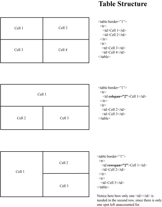
You can create different table structures that aren't strict grids by using colspan to stretch table cells horizontally across the natural cell divisions, or rowspan to collapse vertical divisions between cells. This graphic will probably explain it much more clearly.
The cellpadding="25" is just my personal preference for giving cell-content margins in a large table. When I'm using a smaller table (as a component among other components within a page), I like to use a number between 8 and 15.
If, for example, you wanted a simple page with a graphic in the center, you could type the following:
Notice that I don't have the <tr> </tr> tags here. They aren't necessary if your table only has one single row.
Next: Image files Top
Tables
Tables are grid-based structural elements -- either visible or invisible -- that webdesigners learned to structure their webpages with. Contemporary designers will phase them out in favor of CSS structuring, but such CSS structuring can become complicated for the beginner, and tables do work fine. I also have a soft spot for tables -- once I got a handle on table-structures, HTML began to feel much more like a creative medium for me.First of all, here's a simple table:
|
|
|
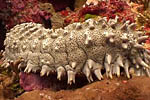
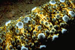
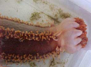
| The sea cucumber is an echinoderm of the class Holothuroidea, with an elongated body and leathery skin, which is found on the sea floor worldwide. | It is so named because of its cucumber-like shape. Like all echinoderms, sea cucumbers have an endoskeleton just below the skin. | Sea cucumbers are generally scavengers, feeding on debris in the benthic layer. |
This table has a stack of 2 horizontal rows, and each row has 3 table cells. I started out with opening and closing table tags (<table> </table>) and created 2 rows (<tr> </tr>), like so:
<table>
<tr>
</tr>
<tr>
</tr>
</table>
<tr>
</tr>
<tr>
</tr>
</table>
At this point, this HTML would have no appearance in a browser -- it needs table cells and content. So here come the table cells:
<table border="1">
<tr>
<td>
</td>
<td>
</td>
<td>
</td>
</tr>
<tr>
<td>
</td>
<td>
</td>
<td>
</td>
</tr>
</table>
<tr>
<td>
</td>
<td>
</td>
<td>
</td>
</tr>
<tr>
<td>
</td>
<td>
</td>
<td>
</td>
</tr>
</table>
A table insists on being a grid, so it's important that if the first row has 3 table cells, then the second row must have 3 table cells accounted for. Otherwise, there will be errors in how the browser creates the table.
Also notice that I added border="1" to the table tag. This is really helpful to do in the beginning, so that you can see how the table is behaving while you're putting it together. You're always welcome to change it to border="0" if you'd prefer the table to be an invisible structuring device.
Now I'm going to add content: image tags (<img>) for the cells in the first row, and text content for the cells in the second row.
<table border="1">
<tr>
<td>
<img src="media/seacucumber.jpg" width="150" height="100" border="1">
</td>
<td>
<img src="media/seacucumber2.jpg" width="150" height="100" border="1">
</td>
<td>
<img src="media/seacucumber3.jpg" width="150" height="100" border="1">
</td>
</tr>
<tr>
<td>
The sea cucumber is an echinoderm of the class Holothuroidea, with an elongated body and leathery skin, which is found on the sea floor worldwide.
</td>
<td>
It is so named because of its cucumber-like shape. Like all echinoderms, sea cucumbers have an endoskeleton just below the skin.
</td>
<td>
Sea cucumbers are generally scavengers, feeding on debris in the benthic layer.
</td>
</tr>
</table>
<tr>
<td>
<img src="media/seacucumber.jpg" width="150" height="100" border="1">
</td>
<td>
<img src="media/seacucumber2.jpg" width="150" height="100" border="1">
</td>
<td>
<img src="media/seacucumber3.jpg" width="150" height="100" border="1">
</td>
</tr>
<tr>
<td>
The sea cucumber is an echinoderm of the class Holothuroidea, with an elongated body and leathery skin, which is found on the sea floor worldwide.
</td>
<td>
It is so named because of its cucumber-like shape. Like all echinoderms, sea cucumbers have an endoskeleton just below the skin.
</td>
<td>
Sea cucumbers are generally scavengers, feeding on debris in the benthic layer.
</td>
</tr>
</table>
The indentations I've been making are just to inject some visual clarity -- they aren't a required part of HTML scripting.
Here's how the table will look when the browser reads the HTML:
|
|
|
|
| The sea cucumber is an echinoderm of the class Holothuroidea, with an elongated body and leathery skin, which is found on the sea floor worldwide. | It is so named because of its cucumber-like shape. Like all echinoderms, sea cucumbers have an endoskeleton just below the skin. | Sea cucumbers are generally scavengers, feeding on debris in the benthic layer. |
Notice how table cells naturally pull content toward the left, and how the flexible table structure seems to shrinkwrap around the content (the best it can).
It still needs the following
- Some margins inside of table cells, so that content doesn't look so cramped
- Centering for the images
<table border="1" cellspacing="0" cellpadding="8">
<tr>
<td align="center">
<img src="media/seacucumber.jpg" width="150" height="100" border="1">
</td>
<td align="center">
<img src="media/seacucumber2.jpg" width="150" height="100" border="1">
</td>
<td align="center">
<img src="media/seacucumber3.jpg" width="150" height="100" border="1">
</td>
</tr>
<tr>
<td>
The sea cucumber is an echinoderm of the class Holothuroidea, with an elongated body and leathery skin, which is found on the sea floor worldwide.
</td>
<td>
It is so named because of its cucumber-like shape. Like all echinoderms, sea cucumbers have an endoskeleton just below the skin.
</td>
<td>
Sea cucumbers are generally scavengers, feeding on debris in the benthic layer.
</td>
</tr>
</table>
<tr>
<td align="center">
<img src="media/seacucumber.jpg" width="150" height="100" border="1">
</td>
<td align="center">
<img src="media/seacucumber2.jpg" width="150" height="100" border="1">
</td>
<td align="center">
<img src="media/seacucumber3.jpg" width="150" height="100" border="1">
</td>
</tr>
<tr>
<td>
The sea cucumber is an echinoderm of the class Holothuroidea, with an elongated body and leathery skin, which is found on the sea floor worldwide.
</td>
<td>
It is so named because of its cucumber-like shape. Like all echinoderms, sea cucumbers have an endoskeleton just below the skin.
</td>
<td>
Sea cucumbers are generally scavengers, feeding on debris in the benthic layer.
</td>
</tr>
</table>
cellspacing="0": this collapses any gaps that a browser might slip in-between table cells.
cellpadding="8": this created an 8-pixel margin within the table cells. The "8" is just a random, habitual number I selected.
align="center": this causes the table cell to center its content. I only used this for the images, and let the text content do its own thing. I could have chosen to align things "left" or "right" (although "left" isn't really needed -- it's the default position). Similarly, I can use the valign attribute to vertically-align content "top", "middle" or "bottom".
Once again, the finished table:
|
|
|
|
| The sea cucumber is an echinoderm of the class Holothuroidea, with an elongated body and leathery skin, which is found on the sea floor worldwide. | It is so named because of its cucumber-like shape. Like all echinoderms, sea cucumbers have an endoskeleton just below the skin. | Sea cucumbers are generally scavengers, feeding on debris in the benthic layer. |
Tables like to shrink around content, but content tends to want to stretch out and relax. The result is often a bit of give-and-take between the two forces, and sometimes not entirely predictable until you see it in a browser window. You can give (optional) height/width attributes to both the <table> and <td> tags for better control. Examples:
- <table width="500" height="400"> (plain #'s denote #'s of pixels)
- <table width="80%" height="20%"> (percentile of the entire page, or whatever element contains that table)
- <table width="500" height="20%"> (you can mix and match)
- <td width="200" height="125">
- <td width="20%" height="20%"> (that's 20% of the table width/height, not of the entire page)
You can create different table structures that aren't strict grids by using colspan to stretch table cells horizontally across the natural cell divisions, or rowspan to collapse vertical divisions between cells. This graphic will probably explain it much more clearly.
Tables for page structure
You can use the following table tag as the first thing you type within your <body> </body> tags:<table border="1" width="100%" height="100%" cellspacing="0" cellpadding="25">The width/height attributes cause the table to fill up the entire page (if you really want it flush with the browser edges, then you'd need to collapse the margins that browsers like to give to the <body> tag. This is done with CSS -- more on that later). This way, you can better control how to develop an overall layout for paragraphs, images, logos and other elements on the page.
The cellpadding="25" is just my personal preference for giving cell-content margins in a large table. When I'm using a smaller table (as a component among other components within a page), I like to use a number between 8 and 15.
If, for example, you wanted a simple page with a graphic in the center, you could type the following:
<table border="1" width="100%" height="100%" cellspacing="0" cellpadding="25">
<td align="center" valign="middle">
<img src="graphic.gif" width="100" height="100" border="0">
</td>
</table>
<td align="center" valign="middle">
<img src="graphic.gif" width="100" height="100" border="0">
</td>
</table>
Notice that I don't have the <tr> </tr> tags here. They aren't necessary if your table only has one single row.
Next: Image files Top