Website Construction for Visual Artists
Sometimes, freeware image-editors do not support GIF format. This is because software developers must pay licensing fees to include GIF technology (which is not the case for JPEG). PNG is an open source format intended to replace GIF, but it has only recently been embraced by browsers. In any case, it's good to read about the features of a program (and supplant this with a Googlesearch for reviews/discussions) before investing time with it.
Photoshop has a very excellent "Save for Web" function that cuts through some of the excess labor in formatting an image, but I'll run through the steps I used to take in older Photoshop versions, since they may have equivalents in freeware editors:
In Photoshop, when you open an image, it is by default a "background" layer and resistant to many transformations (under Image/Adjustments or Edit/Transform, many options will be greyed-out). This is the application just trying to preserve the layer for you, and encourage you to work from a copy. You can copy that layer, or just double-click on it to get the "New Layer" console, and click "OK".
Note: Windows screens are traditionally darker than Mac screens. If you're on Windows, bump up those highlights a bit, and make sure those shadows have enough strength to withstand increased brightness. If you're on a Mac, don't place too much faith on subtle darknesses -- they may all fall to black for the other camp of viewers.
Resizing images:
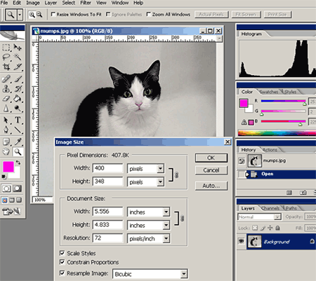
Images should be resized at 72 DPI to conform to most monitors, and reduced to several hundred pixels in either direction. I personally aim for 300-600 pixels in either direction, or 70-90 pixels square for thumbnails -- but this is strictly my personal preference. Sometimes this requires me being watchful of the Image Size console: if I change the resolution to 72 DPI, the console may threaten to resize the image smaller than desired. I must then retype either the height or the width coordinates to preserve a suitable size.
Any image scrunched down for Web use is going to look a bit disappointing compared to the original, but that's the nature of the Web, so don't be surprised by that -- it's just the nature of the Web medium.
Important! Once you have reduced the size of your image, do not save it over your original image. Always maintain a good, large 300 DPI image of your artwork.
Logging your image files
When you are inserting your images into your website, you are going to need to know the exact filename, the width and the height. I recommend that you keep scratch paper handy and write down this information as you prepare your images, and then consult that paper when writing your <img> tags and attributes.
Saving images:
The last step is to compress your graphics to an Internet-friendly filetype. The basic image filetypes are .jpg and .gif. JPEGs are best used for images with gradations, blurs, and for photographic images in general. GIFs are used for images that consists of flat colors and hard edges. GIFs are smaller and load faster, and are advantageous for making page-design and navigation elements (like logos and buttons).
With JPEGs you can toggle the compression strength (and preview the results). I usually compress large images at a level of 7 or 8 (out of 12), and a level of 5 or 6 for thumbnails -- since their job is to load fast and not necessarily to provide a gratifying visual experience.
When creating page-design elements to be saved as GIF files, I do tend to work with "web-safe" colors. This is a palette of 256 colors that I can view by opening the color picker in Photoshop and clicking the "Only Web Colors" button. For modern computer monitors which display millions of colors, this isn't really an issue, but if the browser is dodgy or the visitor is viewing the site with a small portable gadget, a failure to observe web-safe colors can come back to haunt me.
Please note: if your digital images are in "CYMK" mode you'll need to change them to "RGB" mode (select Image/Mode to change this). Otherwise, you can end up preparing your images, compressing to JPEG, inserting them into your website, and realize that the browser fails to render them. It's good to get in the habit of checking the CYMK/RGB mode of your images before you work on reducing them, just to avoid this headache later. This normally shouldn't happen, unless your scanner is set to CYMK, or you receive your scans from a designer who is accustomed to working in print.

Fortunately, recent versions of Photoshop allow you to skip the resizing steps. When you select this option, you get a console with plenty of options (filetype, compression quality, etc.) You can also set the image dimensions here, using the "Image Size" tab on the right side (just left of the "Color Table" tab). At the top left of the console are options for previewing your optimized image under different compression rates. The reduction to 72 DPI is automatic, so you don't have to worry about it.
<img src="name of image file">
<img src="siteLogo.jpg">
If your images are kept in a separate folder, then you'll need this format:
<img src="name of folder / name of image file">
<img src="images/siteLogo.jpg">
Personally, I recommend this format:
<img src="name of image file" width="#" height="#" border="#" alt="name of image">
Here are more <img> attributes:
Above, I just jammed the <img> script after the word "skin", but the height of the image forces a huge gap above that line of text. It would be better if I could have the image and text side-by-side. This can be done using tables (or float properties in CSS), but there's an easy way to do it. I'll type the script for the image first, using an align attribute, and then allow the text to fall to the right:
The result:
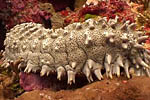 The sea cucumber is an echinoderm of the class Holothuroidea, with an elongated body and leathery skin, which is found on the sea floor worldwide. It is so named because of its cucumber-like shape. Like all echinoderms, sea cucumbers have an endoskeleton just below the skin. Sea cucumbers are generally scavengers, feeding on debris in the benthic layer.
Now, let's say I put 3 <br> linebreaks after the word "worldwide" in the first sentence:
The sea cucumber is an echinoderm of the class Holothuroidea, with an elongated body and leathery skin, which is found on the sea floor worldwide.
It is so named because of its cucumber-like shape. Like all echinoderms, sea cucumbers have an endoskeleton just below the skin. Sea cucumbers are generally scavengers, feeding on debris in the benthic layer.
The text spills underneath the image in a clumsy fashion. So I'm going to make the following adjustment to the HTML:
The clear attribute causes proceeding content to start fresh on the next available line:
The sea cucumber is an echinoderm of the class Holothuroidea, with an elongated body and leathery skin, which is found on the sea floor worldwide.
It is so named because of its cucumber-like shape. Like all echinoderms, sea cucumbers have an endoskeleton just below the skin. Sea cucumbers are generally scavengers, feeding on debris in the benthic layer.
Example #1:
 Script:
<a href="media/mumps.jpg">
<img src="media/mumps_sm.jpg" width="75" height="75" border="1">
</a>
Example #2:
Script:
<a href="imagedemo.html">
<img src="media/mumps_sm.jpg" width="75" height="75" border="1">
</a>
You can click the thumbnails to view how they operate differently. Example #1 simply links the thumbnail ("mumps_sm.jpg") to the larger image ("mumps.jpg") -- both are in a folder called "media". The browser understands to create a new page to house the image, which is usually a plain white default page with the image positioned in the top corner. Since this is not the most interesting way to showcase images, Example #2 shows how you can link the thumbnail to a whole new webpage ("imagedemo.html").
Next: Video files Top
Image Files
Preparing images for the Web
You will need to get access to Photoshop, or another suitable image-editing application, to prepare images for your site. Photoshop is the industry standard for image manipulation and design for either print or the Web. Here are some free alternatives:- Gimp (Windows, Mac OSX)
- PhotoPlus 6 (Windows)
- Paint.NET (Windows)
- ImageForge (Windows)
- Seashore (Mac OSX)
- Paintbrush (Mac OSX)
Sometimes, freeware image-editors do not support GIF format. This is because software developers must pay licensing fees to include GIF technology (which is not the case for JPEG). PNG is an open source format intended to replace GIF, but it has only recently been embraced by browsers. In any case, it's good to read about the features of a program (and supplant this with a Googlesearch for reviews/discussions) before investing time with it.
Photoshop has a very excellent "Save for Web" function that cuts through some of the excess labor in formatting an image, but I'll run through the steps I used to take in older Photoshop versions, since they may have equivalents in freeware editors:
- Adjust the levels -- making sure the brights are bright, and the darks are dark. This is done with Image/Adjustments/Levels
- Color balance -- particularly if I've photographed an image, as opposed to scanning it. Image/Adjustments/Color balance
- Rotating the image slightly, unless my digital copy is properly aligned to the x/y grid. The handiest way to rotate an image is to use the Move tool -- with the "Show Transform Controls" box activated at the top bar -- and float the cursor just outside of one of the square corners of the image til you see a curved double-arrow. Then click-drag. Otherwise, you can use Edit/Transform/Rotate
- Cropping to the edges of the artwork, or to an appropriate margin.
- Resizing the image for the Web. More on this below.
- Sharpening the image, just slightly -- the algorithm that shrinks images down can leave edges looking a bit blurry. The Sharpen, Sharpen Edges and Unsharp Mask filters are available under the Filters/Sharpen menu, but I prefer Unsharp Mask because you can control the intensity of the effect.
In Photoshop, when you open an image, it is by default a "background" layer and resistant to many transformations (under Image/Adjustments or Edit/Transform, many options will be greyed-out). This is the application just trying to preserve the layer for you, and encourage you to work from a copy. You can copy that layer, or just double-click on it to get the "New Layer" console, and click "OK".
Note: Windows screens are traditionally darker than Mac screens. If you're on Windows, bump up those highlights a bit, and make sure those shadows have enough strength to withstand increased brightness. If you're on a Mac, don't place too much faith on subtle darknesses -- they may all fall to black for the other camp of viewers.
Resizing images:
Images should be resized at 72 DPI to conform to most monitors, and reduced to several hundred pixels in either direction. I personally aim for 300-600 pixels in either direction, or 70-90 pixels square for thumbnails -- but this is strictly my personal preference. Sometimes this requires me being watchful of the Image Size console: if I change the resolution to 72 DPI, the console may threaten to resize the image smaller than desired. I must then retype either the height or the width coordinates to preserve a suitable size.
Any image scrunched down for Web use is going to look a bit disappointing compared to the original, but that's the nature of the Web, so don't be surprised by that -- it's just the nature of the Web medium.
Important! Once you have reduced the size of your image, do not save it over your original image. Always maintain a good, large 300 DPI image of your artwork.
Logging your image files
When you are inserting your images into your website, you are going to need to know the exact filename, the width and the height. I recommend that you keep scratch paper handy and write down this information as you prepare your images, and then consult that paper when writing your <img> tags and attributes.
Saving images:
The last step is to compress your graphics to an Internet-friendly filetype. The basic image filetypes are .jpg and .gif. JPEGs are best used for images with gradations, blurs, and for photographic images in general. GIFs are used for images that consists of flat colors and hard edges. GIFs are smaller and load faster, and are advantageous for making page-design and navigation elements (like logos and buttons).
With JPEGs you can toggle the compression strength (and preview the results). I usually compress large images at a level of 7 or 8 (out of 12), and a level of 5 or 6 for thumbnails -- since their job is to load fast and not necessarily to provide a gratifying visual experience.
When creating page-design elements to be saved as GIF files, I do tend to work with "web-safe" colors. This is a palette of 256 colors that I can view by opening the color picker in Photoshop and clicking the "Only Web Colors" button. For modern computer monitors which display millions of colors, this isn't really an issue, but if the browser is dodgy or the visitor is viewing the site with a small portable gadget, a failure to observe web-safe colors can come back to haunt me.
Please note: if your digital images are in "CYMK" mode you'll need to change them to "RGB" mode (select Image/Mode to change this). Otherwise, you can end up preparing your images, compressing to JPEG, inserting them into your website, and realize that the browser fails to render them. It's good to get in the habit of checking the CYMK/RGB mode of your images before you work on reducing them, just to avoid this headache later. This normally shouldn't happen, unless your scanner is set to CYMK, or you receive your scans from a designer who is accustomed to working in print.
"Save for Web" in Photoshop:
(aka: "Save for Web and Devices")
Fortunately, recent versions of Photoshop allow you to skip the resizing steps. When you select this option, you get a console with plenty of options (filetype, compression quality, etc.) You can also set the image dimensions here, using the "Image Size" tab on the right side (just left of the "Color Table" tab). At the top left of the console are options for previewing your optimized image under different compression rates. The reduction to 72 DPI is automatic, so you don't have to worry about it.
Placing images in a webpage
A simple image link:<img src="name of image file">
<img src="siteLogo.jpg">
If your images are kept in a separate folder, then you'll need this format:
<img src="name of folder / name of image file">
<img src="images/siteLogo.jpg">
Personally, I recommend this format:
<img src="name of image file" width="#" height="#" border="#" alt="name of image">
Here are more <img> attributes:
title="" This creates a bit of text that pops up in a small window near your cursor, when you mouse over the image.Keep in mind that hspace and vspace are outdated in favor of box properties in CSS.
hspace="" This creates a horizontal margin for the image. Hspace="10" would preserve 10 pixels of space to both the left and the right of the image.
vspace="" This does the same, but vertically. Vspace="10" would force 10 pixels of space both above and below the image.
Negotiating images and text
Browsers will treat images like they treat text -- they are not block-level elements (meaning: they don't cause a line-break). They simply interrupt the document flow:
The sea cucumber is an echinoderm of the class Holothuroidea, with an elongated body and leathery skin, which is found on the sea floor worldwide. It is so named because of its cucumber-like shape. Like all echinoderms, sea cucumbers have an endoskeleton just below the skin. Sea cucumbers are generally scavengers, feeding on debris in the benthic layer.
Sea cucumbers are generally scavengers, feeding on debris in the benthic layer. Above, I just jammed the <img> script after the word "skin", but the height of the image forces a huge gap above that line of text. It would be better if I could have the image and text side-by-side. This can be done using tables (or float properties in CSS), but there's an easy way to do it. I'll type the script for the image first, using an align attribute, and then allow the text to fall to the right:
<img src="media/seacucumber.jpg" width="150" height="100" border="1" align="left">
The sea cucumber is an echinoderm of the class Holothuroidea, with an elongated body and leathery skin, which is found on the sea floor worldwide. It is so named because of its cucumber-like shape. Like all echinoderms, sea cucumbers have an endoskeleton just below the skin. Sea cucumbers are generally scavengers, feeding on debris in the benthic layer.
The sea cucumber is an echinoderm of the class Holothuroidea, with an elongated body and leathery skin, which is found on the sea floor worldwide. It is so named because of its cucumber-like shape. Like all echinoderms, sea cucumbers have an endoskeleton just below the skin. Sea cucumbers are generally scavengers, feeding on debris in the benthic layer.
The result:
The sea cucumber is an echinoderm of the class Holothuroidea, with an elongated body and leathery skin, which is found on the sea floor worldwide. It is so named because of its cucumber-like shape. Like all echinoderms, sea cucumbers have an endoskeleton just below the skin. Sea cucumbers are generally scavengers, feeding on debris in the benthic layer.Now, let's say I put 3 <br> linebreaks after the word "worldwide" in the first sentence:
The sea cucumber is an echinoderm of the class Holothuroidea, with an elongated body and leathery skin, which is found on the sea floor worldwide.It is so named because of its cucumber-like shape. Like all echinoderms, sea cucumbers have an endoskeleton just below the skin. Sea cucumbers are generally scavengers, feeding on debris in the benthic layer.
The text spills underneath the image in a clumsy fashion. So I'm going to make the following adjustment to the HTML:
<img src="media/seacucumber.jpg" width="150" height="100" border="1" align="left">
The sea cucumber is an echinoderm of the class Holothuroidea, with an elongated body and leathery skin, which is found on the sea floor worldwide.<br clear="all"><br><br>
It is so named because of its cucumber-like shape. Like all echinoderms, sea cucumbers have an endoskeleton just below the skin. Sea cucumbers are generally scavengers, feeding on debris in the benthic layer.
The clear attribute causes proceeding content to start fresh on the next available line:
The sea cucumber is an echinoderm of the class Holothuroidea, with an elongated body and leathery skin, which is found on the sea floor worldwide.It is so named because of its cucumber-like shape. Like all echinoderms, sea cucumbers have an endoskeleton just below the skin. Sea cucumbers are generally scavengers, feeding on debris in the benthic layer.
Creating thumbnail links
Thumbnails are the most efficient method of presenting a set of lightweight images for the viewer to sift through and select (loading up a page of large images not only forces the viewer to wait, but is often the mark of a true amateur). This involves an HTML tag to conjure the thumbnail image, nested inside of a link tag that will send the viewer to the large image.Example #1:
 Script:
<a href="media/mumps.jpg">
<img src="media/mumps_sm.jpg" width="75" height="75" border="1">
</a>
Example #2:
Script:<a href="imagedemo.html">
<img src="media/mumps_sm.jpg" width="75" height="75" border="1">
</a>
You can click the thumbnails to view how they operate differently. Example #1 simply links the thumbnail ("mumps_sm.jpg") to the larger image ("mumps.jpg") -- both are in a folder called "media". The browser understands to create a new page to house the image, which is usually a plain white default page with the image positioned in the top corner. Since this is not the most interesting way to showcase images, Example #2 shows how you can link the thumbnail to a whole new webpage ("imagedemo.html").
Next: Video files Top